⟶ 03 / Case
UX research to inform website evolution
A research-led website redesign. Restructuring information architecture and surfacing proof of ROI to help brands overcome their hesitation toward direct mail.
Client
Marketreach (Royal Mail Group)
Year
2025
Role
UX/UI Designer (Agency)
Tags
UX Research, Information Architecture, Web
Context + Role
Marketreach, part of the Royal Mail Group, aims to help companies unleash the magic of mail.
Mail is a traditional media channel that is operationally challenging. Marketreach helps brands and agencies navigate the complexity of direct mail by demonstrating its value and making it easier to plan and launch campaigns.
I worked on this project as a UX/UI designer at an agency, collaborating with one other designer under a Lead Designer and Design Director. My ownership was end-to-end across half of the 15 new templates — taking designs from initial concept through client presentation, iteration, and final handoff. On the research side, I shared responsibilities equally with my co-designer: we alternated between leading interviews and synthesising findings, so both of us stayed close to what users were actually saying. I also co-led three external client workshops, jointly preparing the structure and personally facilitating half of each session driving the exercises and taking notes in real time.
Problem
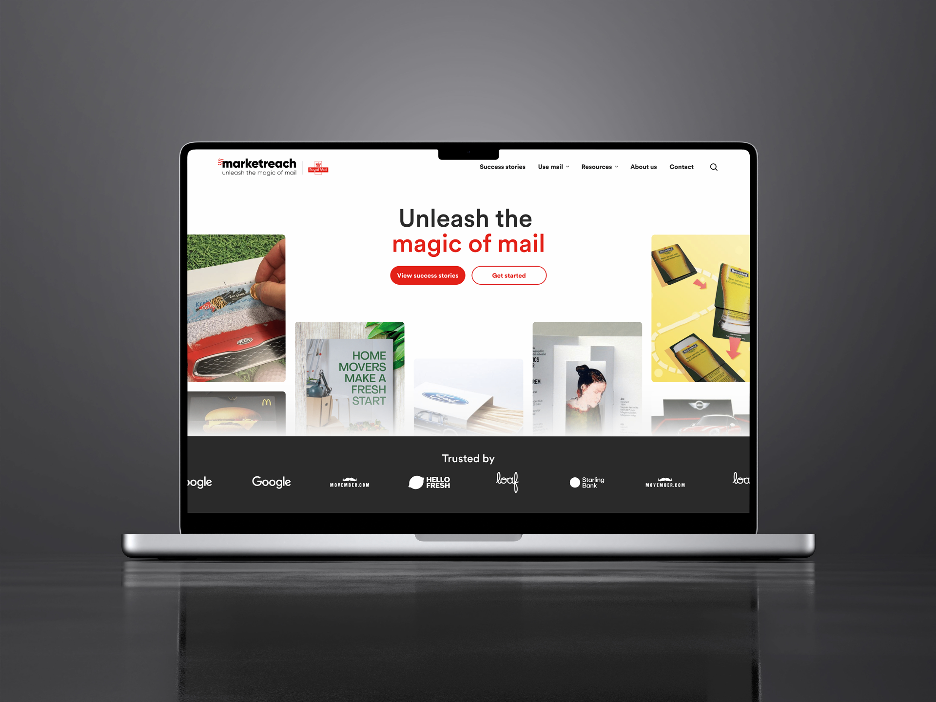
Marketreach's website wasn't converting the people it needed to convince.
Brands and agencies evaluating direct mail as a channel arrived at the site needing one thing above everything else: evidence it worked. They wanted proof of ROI they could reference internally, case studies from similar industries they could share with clients, and data they could use to justify the budget.
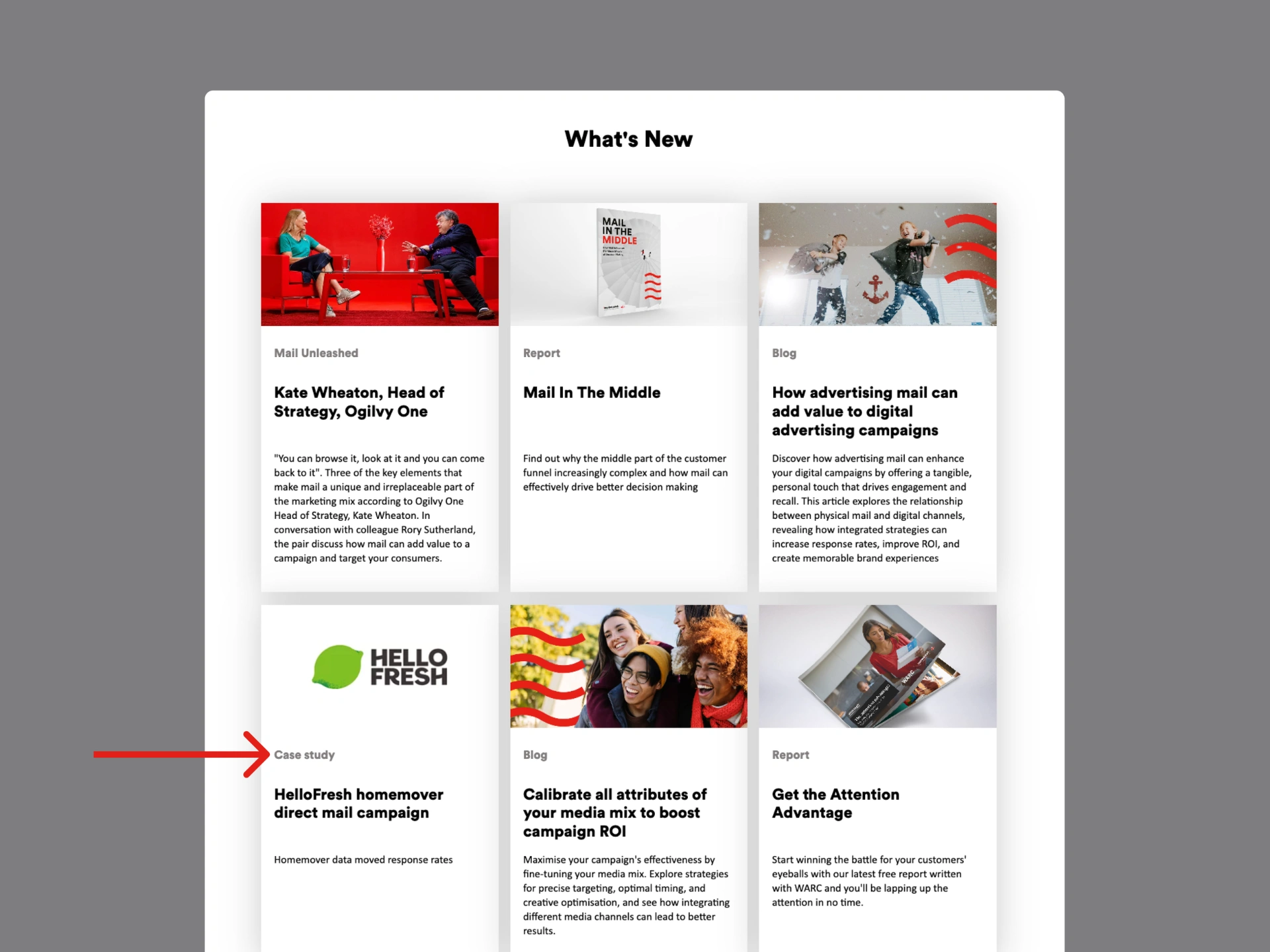
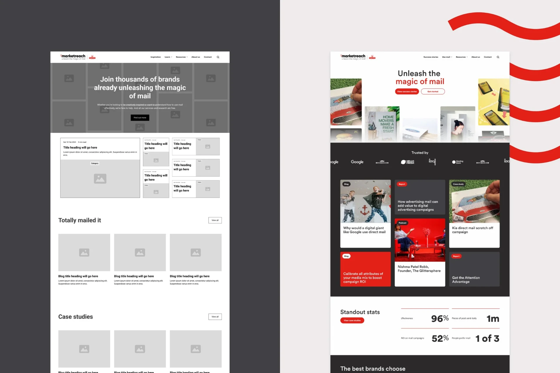
Case studies already had a place in the top-level navigation but that's where their usefulness ended. The cards themselves were inconsistent and uninformative: some featured a client logo, others just a stock photo, none had stats or metrics, and titles and descriptions were too short to give users enough context to know whether a case study was relevant to them. On the homepage, a single case study card appeared once, buried further down the page. The most important content on the site was present but effectively invisible for the users most likely to convert.
Approach
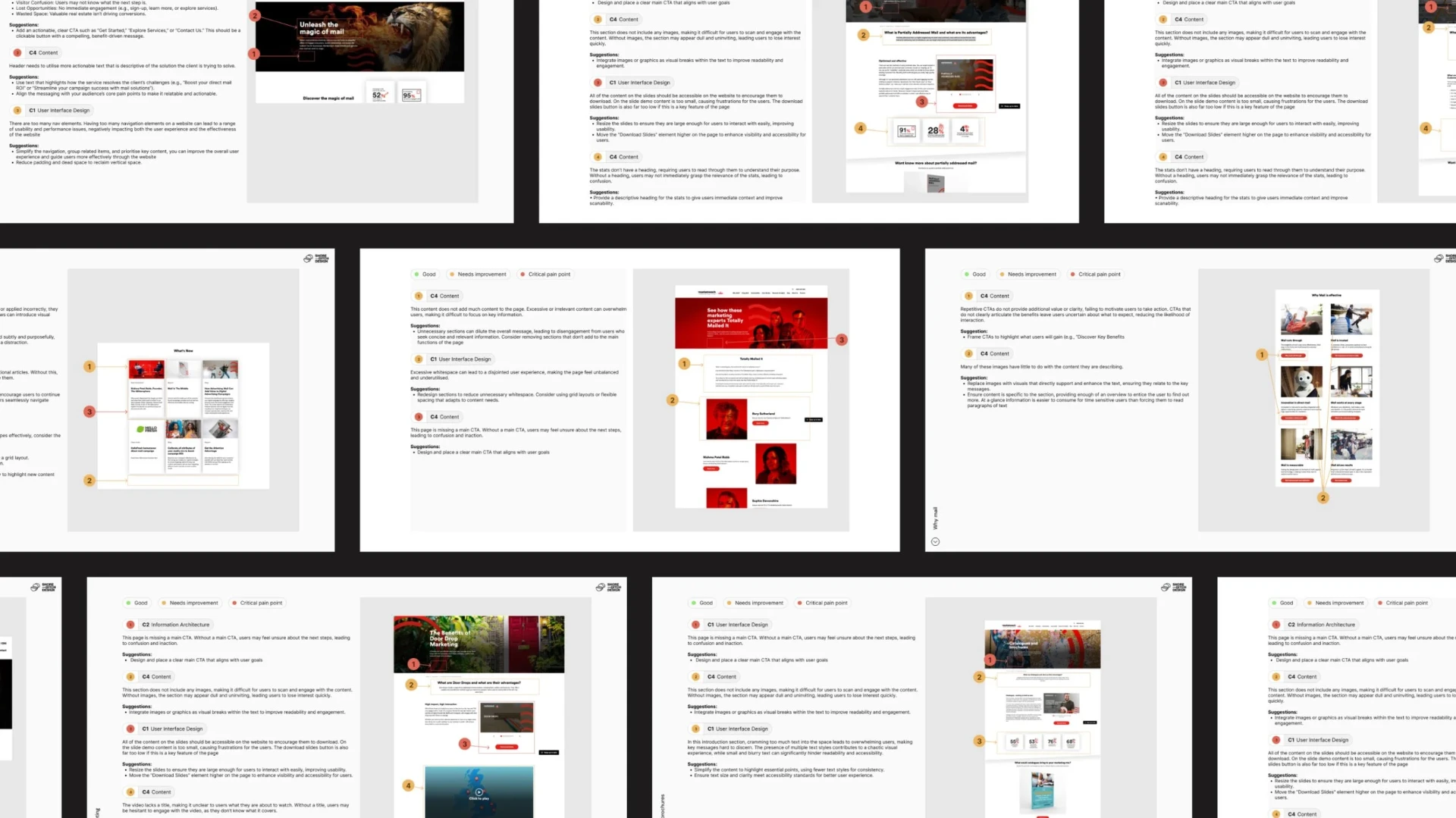
Before designing anything, we needed to understand precisely what was driving and blocking media channel selection for large brands.
We ran a full audit of the existing site, held three client workshops to understand Marketreach's vision, audience, and competitive positioning.
The research came back with a clear signal: users weren't sceptical about direct mail in principle. They were sceptical without proof. That single insight reframed the entire design direction — the site didn't need to educate users about mail, it needed to get them to evidence as fast as possible, in a format they could immediately use.
Research + Findings
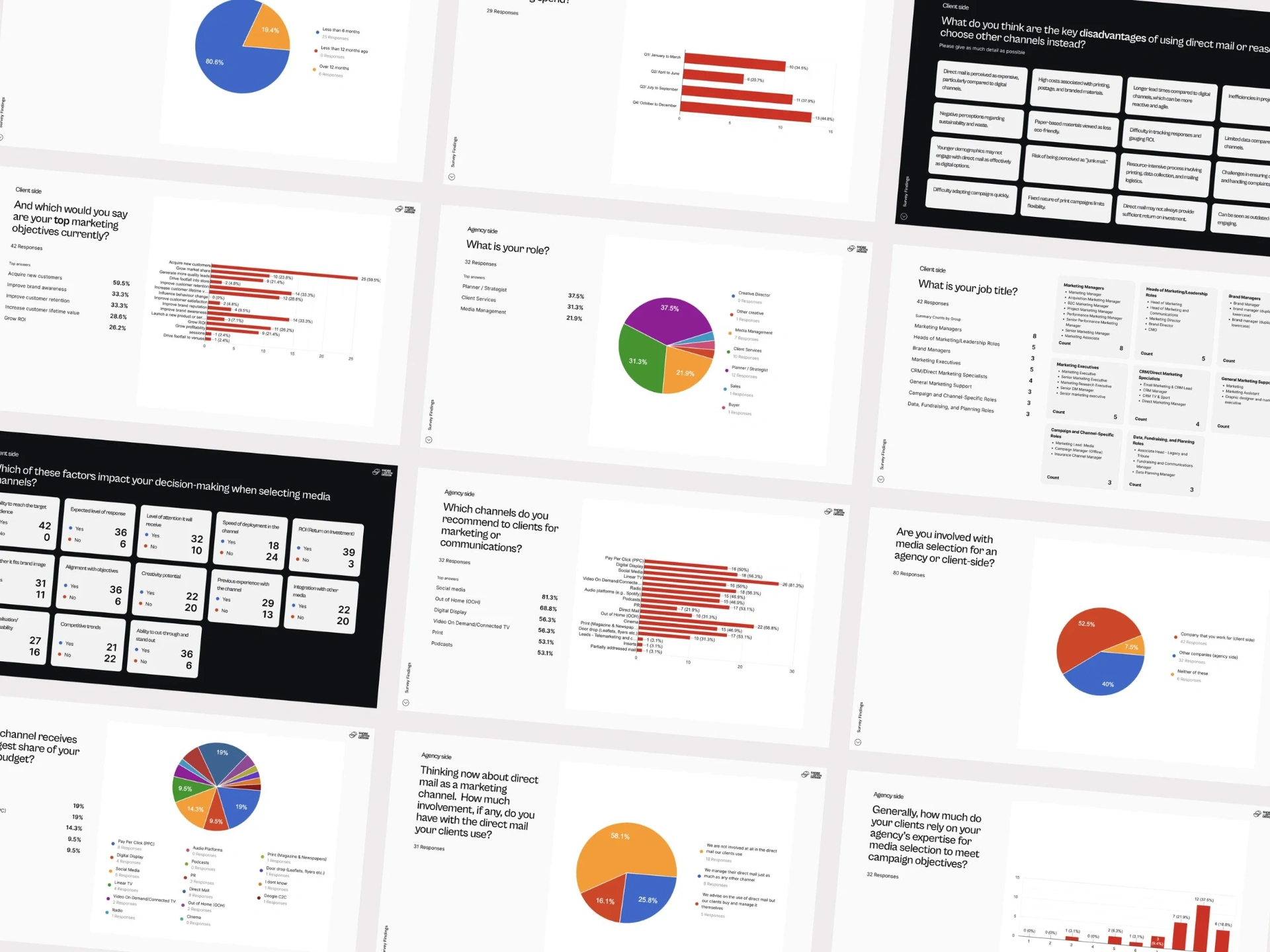
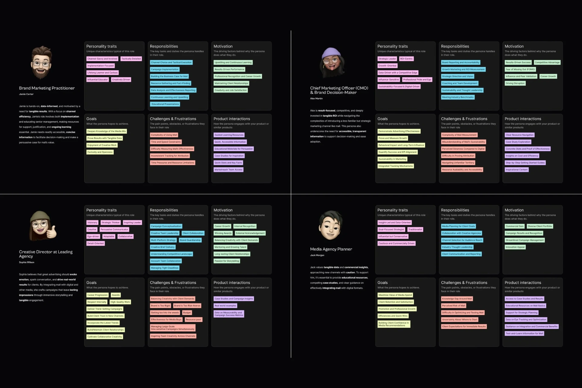
We conducted user interviews across the four persona types and surveyed 80 users to validate and quantify what the interviews surfaced.
The most important finding from user research wasn't about navigation or visual design, it was about how decisions actually get made. Users didn't convert on features or statistics alone. They needed to see a story they could recognise themselves in: a similar industry, a comparable challenge, a clear outcome. Case studies weren't a supporting content type, they were the primary trust-building mechanism that people shared with their team, forwarded to a client, or bookmarked before signing off. That single insight reordered the design priorities. Getting case studies prominent, scannable, and consistent wasn't a nice-to-have. It was the brief.
Survey
Top factors that impact media channel selection
- Ability to reach target audience
- Return on investment (ROI)
- Alignment with objectives
- Ability to cut-through and stand out
Primary reasons that would encourage use of direct mail
- Proof of effectiveness, such as case studies with ROI
- Support from a direct mail expert
The interviews surfaced something more specific than the surveys alone could have. Users didn't just want proof that mail worked. They wanted a story from a similar industry, featuring a recognisable brand, with clear results they could lift and use in their own pitches. They were sharing case studies with clients and internal stakeholders as part of their own selling process. That meant the case study wasn't just content on a website, it was a sales tool being used internally or externally. The existing cards weren't fit for that purpose at all.
Decision 01
Case study cards: 5 iterations and a client negotiation
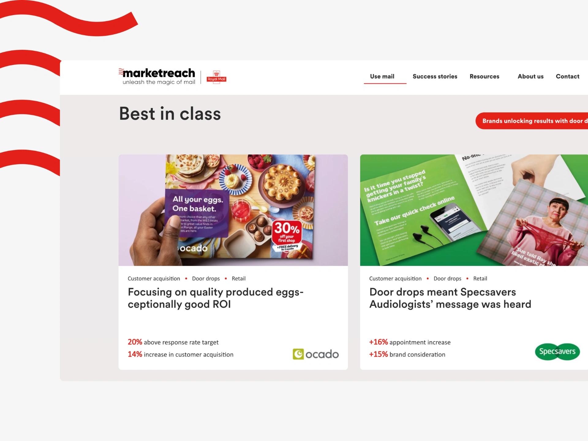
Getting the case study card right was the most contested design decision on the project. I went through 5 iterations to find the right balance: a visual of the actual print campaign to spark imagination, the client logo for immediate brand recognition, and the point of most friction — two key stats pulled to the front of the card.
The client resisted the stats strongly. Their concern was scalability: it would require more maintenance, and what would happen when a future case study didn't have strong numbers to show? My counter was direct: if a case study can't surface 2 compelling stats, it probably isn't ready to be on the site at all. A case study without proof of impact undermines the entire purpose of the page. We landed on the stats. The result is a card that communicates industry, brand, campaign, and measurable outcome at a glance — something a planner could screenshot and drop straight into a client deck.
Decision 02
Information architecture: signposting intent, not content type
Users struggled to orient themselves on the original site. The top-level navigation had too much noise and the typical personas we were targeting considered themselves busy and time-poor. Users were getting distracted by the unbelievable amount of educational content that wasn't necessarily ROI related.
With case studies elevated on the homepage, we restructured the wider information architecture to match how users navigated with intent. All supporting content moved into a top-level Resources section with clear sub-categories for content type and expert knowledge. A new Goals sub-category was introduced because "alignment with objectives" ranked as a top selection factor in the survey. This gave users a direct path to content relevant to their specific campaign brief. Signposts for Goals were built into the majority of pages. Statistics about the effectiveness of mail were foregrounded throughout, giving users data points to lift for their own internal pitches wherever they landed on the site.
Outcome + Impact
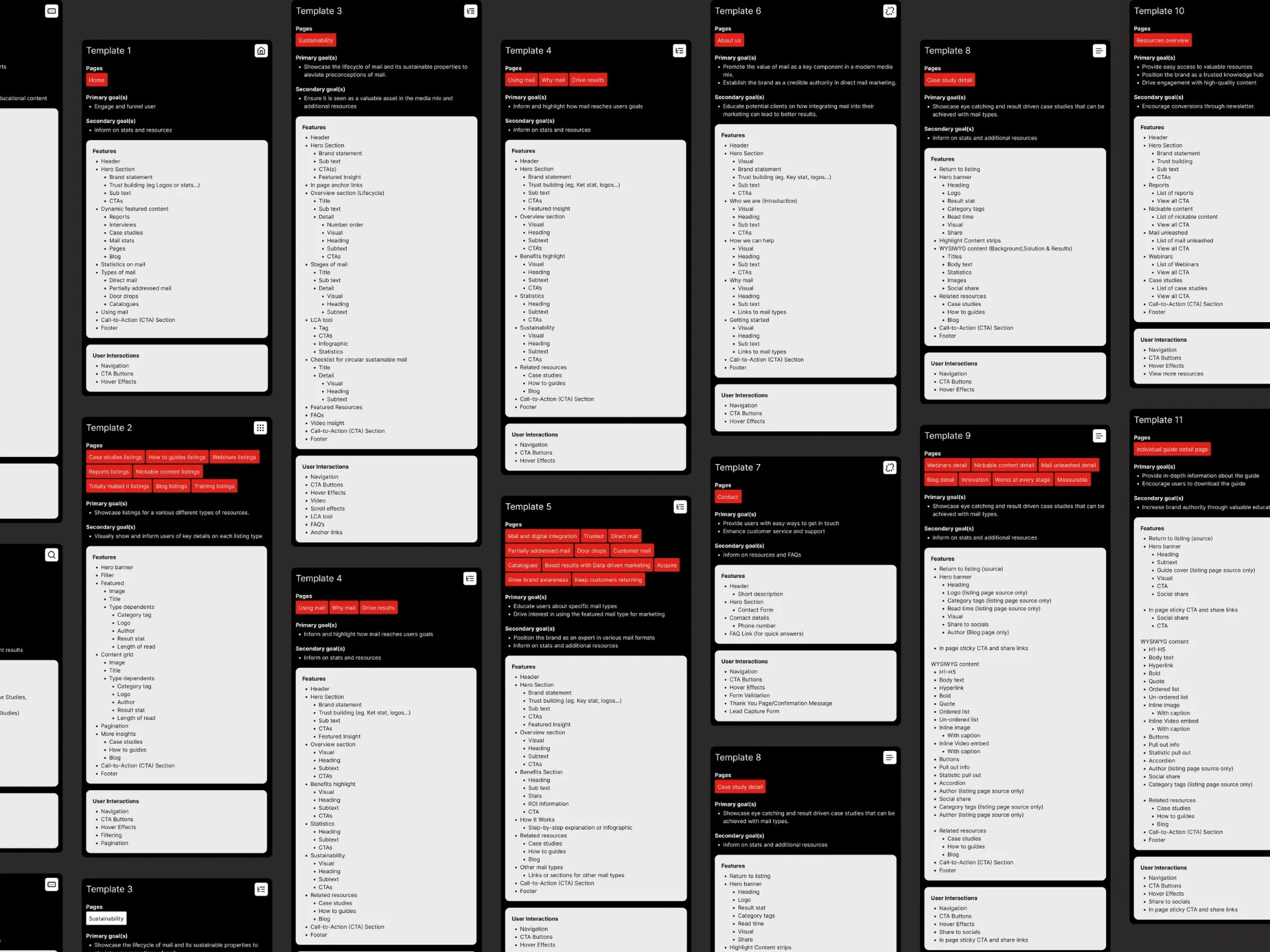
15 new templates were designed, developed, and rolled out across 279 pages.
The redesign achieved a SUS (System Usability Scale) score of 87.5 which places it in the 'excellent' tier of usability benchmarks. In moderated testing with 5 users, 80% completed all 14 tasks without guidance, including finding guides, locating stats, and seeking campaign support.
87.5
SUS score — 'excellent' usability tier
15
New templates rolled out across 279 pages
80%
Of users completed all 14 moderated tasks unassisted
Key Takeaways
I went into this project assuming the core design challenge would be overcoming user scepticism about mail as a channel. The research proved the opposite.
Users weren't sceptical about mail as a channel, they were sceptical without proof. That shifted the entire design direction from explaining mail to getting users to evidence as fast as possible, in a format they could use externally. It's a useful reminder that the brief is a hypothesis, not a diagnosis. The most important design work on this project happened before a single frame was made.
The case study card negotiation reinforced something I'll carry forward: client pushback on scalability is a legitimate concern worth taking seriously, but it shouldn't override a decision that's grounded in user need. The answer to "what if it is too much work to update this content?" isn't to remove it, it's to raise the bar for which case studies make the cut.