⟶ 01 / Case
Turning a vending machine into a conversational AI agent
Redesigning GWI's AI insights tool, Spark, to drive engagement, build trust, and lay the foundation for product-led growth.
Client
GWI
Year
2025
Role
Product Design Lead
Tags
AI, B2B SaaS, Research
Context + Role
GWI launched Spark, an AI-powered insights tool aimed at non-data experts who couldn't access GWI's traditionally complex platform.
This development was part of a shift toward product-led growth. I joined the Spark squad in July 2025, initially working alongside another designer. By November 2025, I became the sole designer on the product, owning end-to-end design direction across all V2 surfaces: information architecture, interaction patterns, the design system, and four rounds of user research I ran from script to findings brief.
Problem
Within the first month, it was clear something wasn't quite working.
Spark launched with a clear ambition: give any GWI user, regardless of data expertise, a faster, more intuitive way to surface insights. After launch, there was a massive spike in sign-ups and usage but week 1 retention fell off a cliff. Users weren't getting enough value and they weren't coming back.
Process
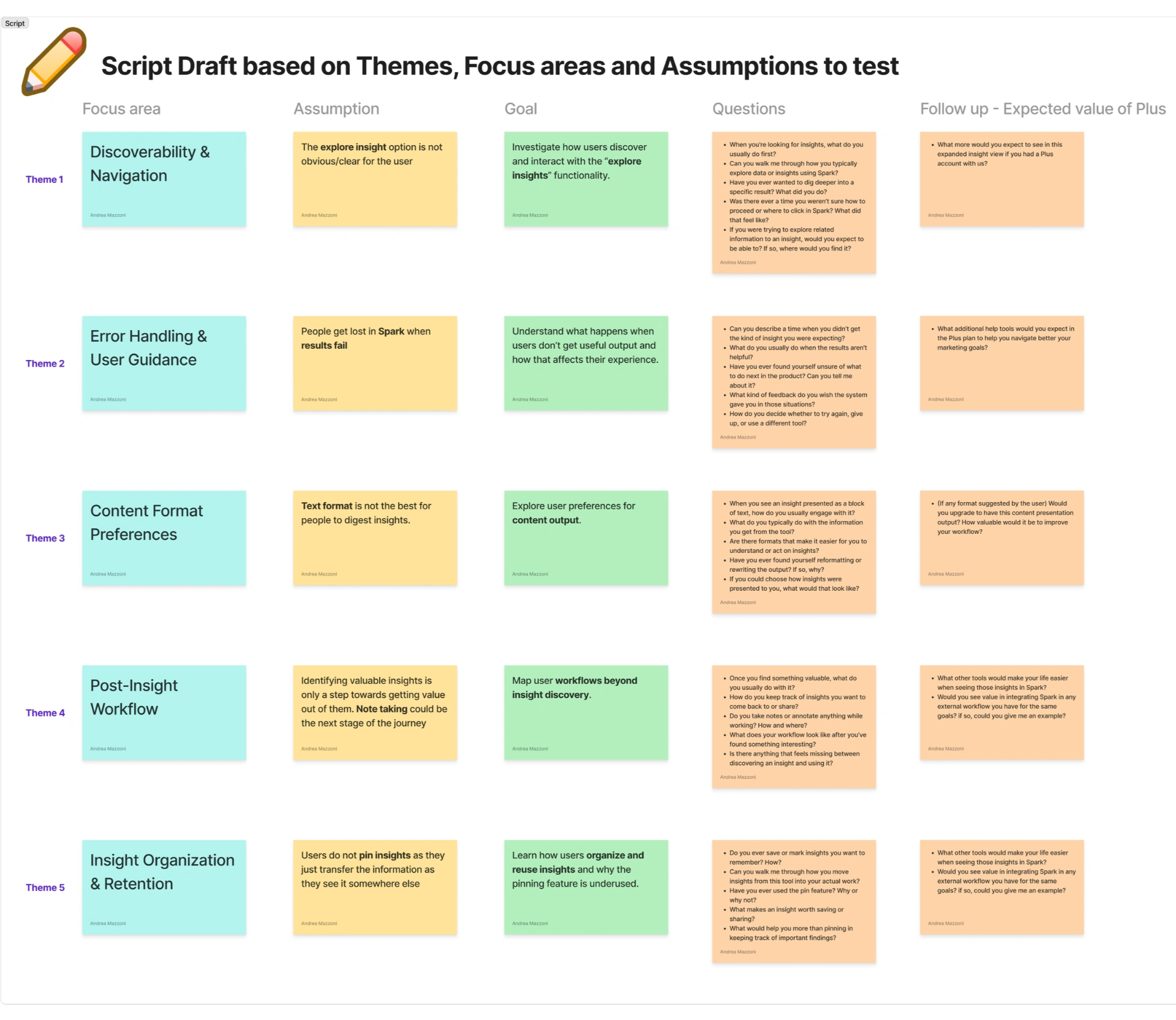
I led 4 rounds of moderated user research across delivering Spark V2.
3 user interviews and 1 user test required writing scripts, facilitating live sessions, synthesising findings in FigJam, and delivering findings briefs to the wider business within a week of each study completing. Running research end-to-end, rather than handing off to a dedicated researcher, meant the insights stayed close to the design decisions.
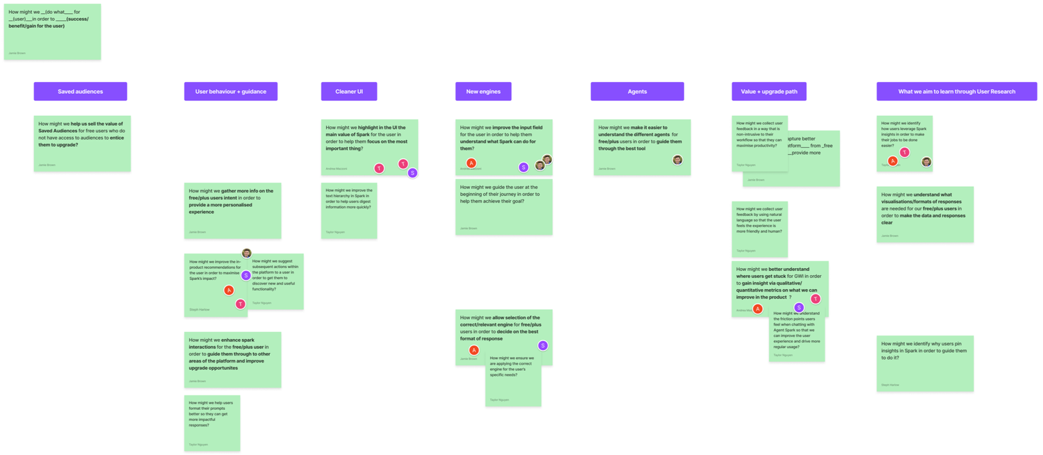
Each round was structured around a specific set of open questions: what do users understand about Spark, where does the experience break down, and what would make them want to return? The answers fed directly into the prioritisation of V2 work so nothing was designed speculatively.
Key Findings
Spark's core promise was to make GWI data accessible to anyone. The early numbers said otherwise.
Two sources of evidence shaped the diagnosis. The engineering team ran a systematic analysis of thousands of prompts submitted in Spark's first month, finding that over 80% were too general, too complex, or incomplete. This meant Spark produced poor-quality responses that left users thinking the tool was broken rather than that their input was the problem. In parallel, I ran 4 rounds of user research which revealed a deeper pattern: users didn't trust what Spark told them, didn't understand what it needed from them, and had no idea what to do once they received a result.
Spark behaved like a vending machine: put a question in, get five bullet points out, conversation over. For a product designed to unlock curiosity in non-expert users, that was a design failure.
Together, these pointed to the same strategic conclusion: V2 couldn't just improve the outputs, it had to guide users toward better inputs, build credibility in its outputs, and give them a reason to keep going after the first response.
5.2%
Week 1 retention in V1
80%
Of V1 prompts too general, complex, or incomplete
4.2
Average prompts per user per session in V1
Design Approach
3 decisions defined the V2 experience. Each came with real trade-offs.
Decision 01
Side panel — a structural bet on the future
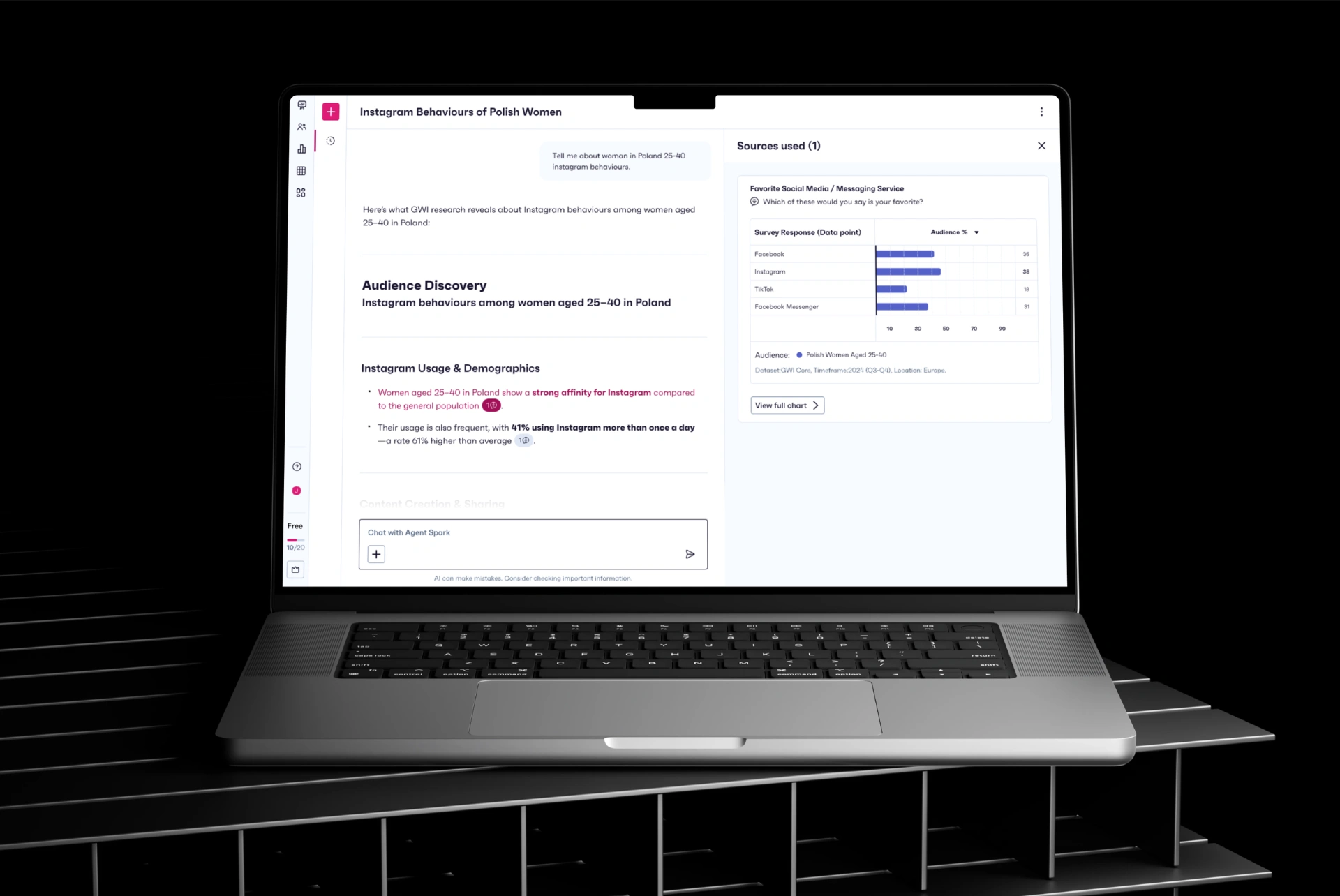
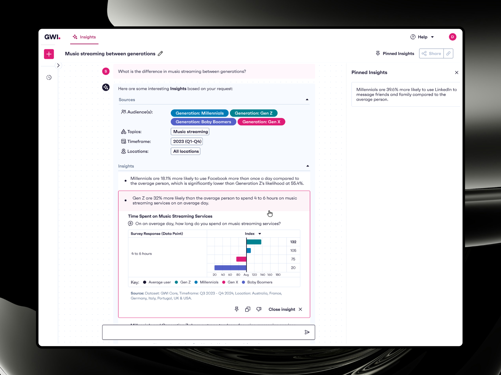
The existing pattern kept sources inline. Opening any source pushed content out of the viewport so users had to scroll back and forth, losing context constantly. I proposed a side panel: sources and charts surfaced alongside the conversation, without breaking the thread. Engineering pushed back because it required a net-new component and added interaction complexity but I held the position.
The side panel wasn't just solving today's UX problem; it was building the architecture for a future where Spark could display charts, presentations, and assets in context without fragmenting the experience. That future is now actively on the roadmap. The pattern is already in place to support it.
The V2 agent is conversational and provides richer responses in natural language with improved text hierarchy. The V2 side panel keeps the conversation thread intact while surfacing sources and charts in context. This meant no scrolling back, no lost thread, no choosing between reading the answer and understanding the data behind it. The cleaner UI was a deliberate reduction: fewer colours, clearer hierarchy, one thing asking for attention at a time.
Decision 02
Source transparency — making trust visible
User interviews consistently surfaced a trust problem: users had no visibility into the data behind Spark's answers, so they couldn't assess whether to believe them. I designed a source chip next to each insight, letting users drill into the underlying survey questions and charts. The hypothesis was that visible provenance would drive interaction and build confidence.
Source opens rose from 13.9% in V1 to 29% in V2, with 38% of those users going on to view the full chart data — direct evidence that making trust visible changed behaviour.
Decision 03
Prompt guidance & next steps — meeting users where they are
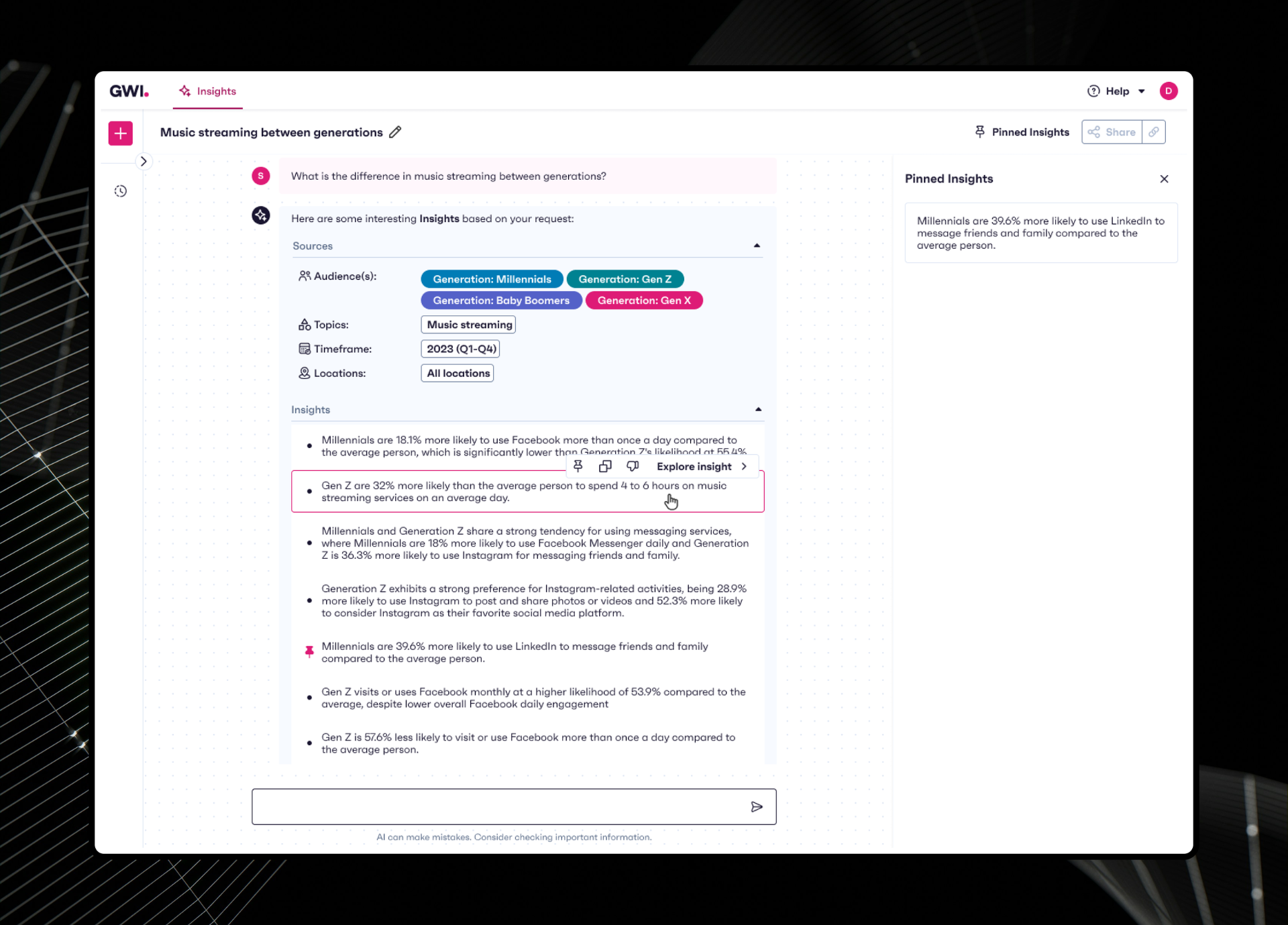
The prompt analysis told us users needed significant hand-holding to get useful results. The interviews told us they didn't know where to go after getting one, especially given V1's lack of conversational nature. I designed a new reasoning component so that users could understand Spark's "thought process" and see what kind of parameters it uses or check how their prompt was interpreted.
On the output side, I added proactive next step suggestions after every response: refine by region, view the chart, explore a related angle. This addressed both failure modes in a single design pattern: users who struggled to start, and users who didn't know how to continue.
Spark's guidance appears as a natural part of the conversation in a markdown reply from the agent that keeps the user in flow rather than interrupting it with a separate UI pattern. It's a deliberate constraint: the current approach works within the existing architecture, while leaving the door open for richer reply surfaces (e.g. structured choices, multiple-select inputs) as the product matures.
Outcome + Impact
The shift from V1 to V2 is measurable across every engagement signal.
The retention numbers tell the clearest story.
| Metric | V1 | V2 | Change |
|---|---|---|---|
| Week 1 retention | 5.2% | 16.4% | +215% |
| Week 4 retention | 3.5% | 7.2% | +106% |
| Monthly active users | 1,874 | 2,226 | +19% |
| Weekly active users | 414 | 562 | +36% |
| Avg. prompts per user | 4.24 | 5.15 | +21% |
| Percent of sources explored | 13.9% | 29% | +109% |
Users aren't just returning more, they're going deeper in every session and engaging with the data behind the outputs.
Key Takeaways
Even without new features, better framing of existing capabilities can increase perceived value.
I learned the importance of triangulating across evidence types. The engineering prompt analysis gave us an early signal about input quality — concrete and quantitative, but limited in scope. The user interviews gave us the human context: why users were prompting badly, what they were feeling when results disappointed them, and what they actually needed to go deeper. Neither source told the full story on its own. Using them together is what made the V2 design direction feel grounded rather than assumed.
I also learned what it means to hold a design position against reasonable pushback. The side panel required more engineering effort and time than the inline approach, and that's a real cost. But designing for the roadmap rather than just the current sprint meant we didn't have to rebuild core interaction patterns six months later. That trade-off was worth making early.
Next Steps
Looking forward
- Experiment with prompt templates or a prompt library to speed up input formulation
- Continue tracking usage metrics to see if the results stay consistent with what we're seeing in early days
- Explore Spark's potential as an asset-creation surface, with the side panel architecture already in place to support charts, presentations, and dashboards built through conversation