⟶ 04 / Case
Designing a social fitness feature from 0–1 for a healthcare workforce platform
Designing for health outcomes and employer retention in a high-turnover industry, while simultaneously overhauling a platform-wide design system across 120+ screens.
Client
CoachUp Care
Year
2024
Role
Product Designer (Agency)
Tags
Product Design, Design Systems, Web & Mobile
Context + Role
CoachUp Care needed a feature that could move the needle on employee health and retention.
CoachUp Care is a workforce management platform used by over 8,000 healthcare providers — home care workers, hospice staff, and skilled nursing professionals — to manage shift productivity, team culture, and employee engagement. They came to us with a dual brief: design a net-new social fitness feature, and use it as the catalyst to refresh the platform's visual identity across every surface.
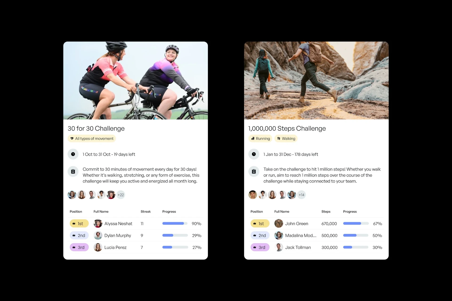
I joined as the product designer responsible for the fitness feature end-to-end, from initial UX audit through to the final high-fidelity designs. Alongside the feature work, I designed 2 of the 5 UI concept directions presented to the client — one of which was selected — and then led the translation of that concept across 120+ desktop and mobile screens.
120+
Screens redesigned
4x
Design iterations
88
Templates audited
Problem
Direct care workers are among the least healthy professionals in the US. The platform wasn't doing anything about it.
The brief surfaced a real public health problem hiding inside a product problem. According to the 2025 MissionCare Workforce Report, direct care workers are 200% more likely to have cardiovascular disease and 150% more likely to struggle with obesity than the general population. High physical demand, irregular hours, and professional isolation are the structural causes — and none of CoachUp Care's existing features addressed them.
The business case was clear: unhealthy and disengaged caregivers drive turnover, and turnover is the core commercial problem CoachUp Care's customers pay to solve. A fitness feature wasn't a wellness bolt-on. It was a retention lever.
The design challenge was more specific: how do you motivate people to track fitness activity when their job is already physically demanding? And how do you make that feel social and rewarding rather than another obligation?
"The risk wasn't building the wrong feature. It was building the right feature in a way that felt like homework."
Process
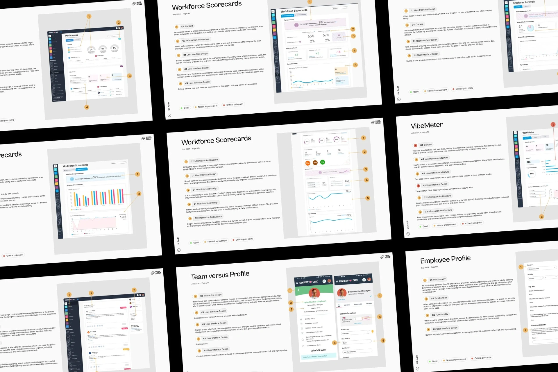
I ran a full UX audit before touching any feature design.
Before designing anything new, I reviewed all 88 existing desktop and mobile page templates and delivered a findings report grounded in usability heuristics. This wasn't busywork — it gave me a clear picture of the design debt we'd be carrying into any new surface, and it informed which patterns were worth inheriting versus rebuilding.
In parallel, I facilitated a design concept workshop with CoachUp Care executives to surface the visual direction they wanted. I presented 2 of 5 concepts. The selected concept then became the foundation for the full design system rebuild.
Research
Competitive and behavioural research.
I used Mobbin to conduct targeted research into fitness app patterns that successfully drive behaviour change. The insight that shaped the feature most: the most engaging fitness products don't lead with performance data. They lead with social proof — what your teammates are doing, celebrating, and achieving. Individual stats create anxiety for low-engagement users. Community activity creates momentum.
That reframe defined the hierarchy of the feature: social feed first, individual metrics second.
Design
Three decisions shaped the feature. Each was a deliberate bet on what would actually change behaviour.
Decision 01: Lead with community, not performance.
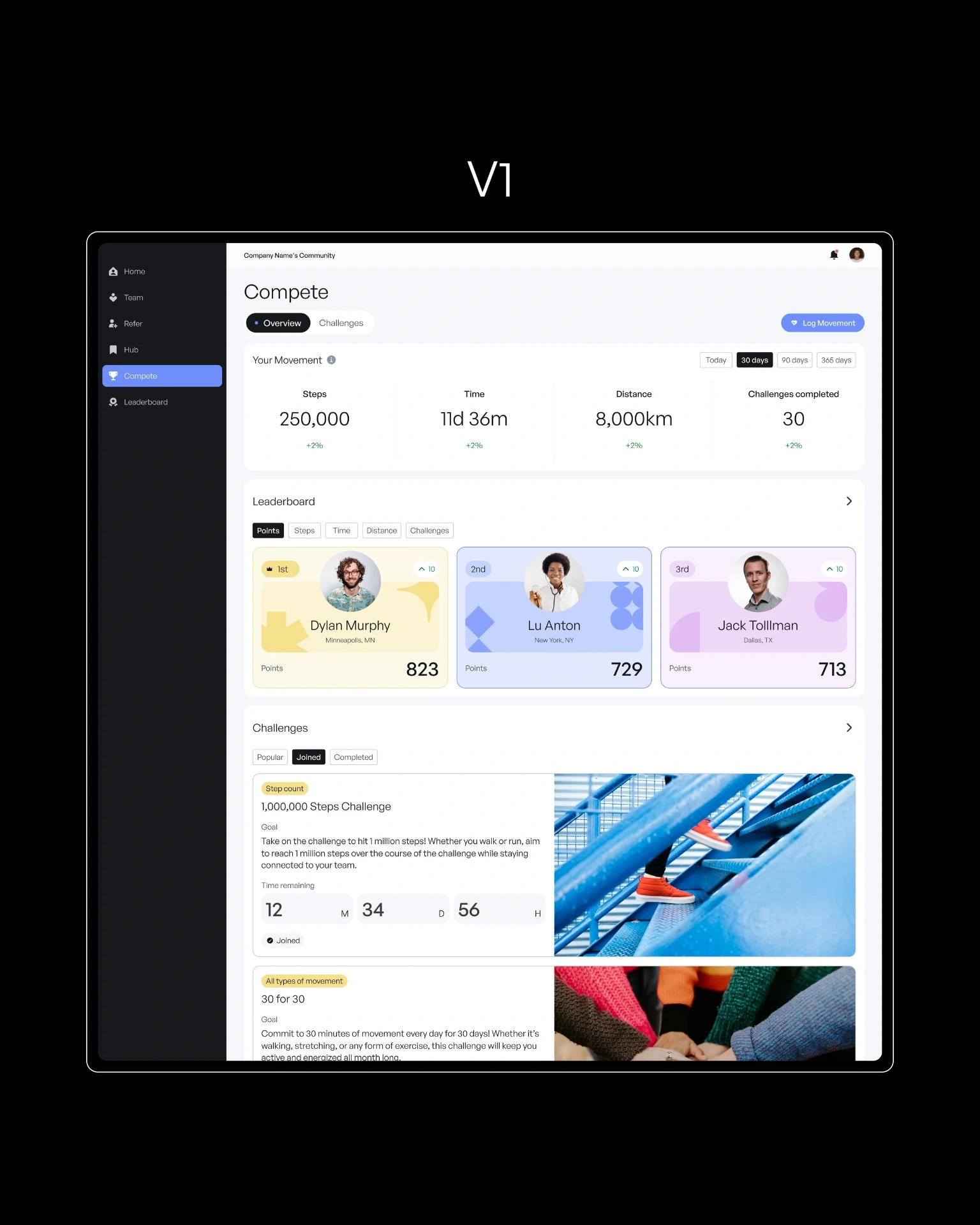
Early wireframes followed a conventional fitness app model: stats front and centre, challenges below. User behaviour research told a different story. For people already doing physically demanding work all day, being confronted with low step counts or trailing challenge positions is demotivating, not galvanising.
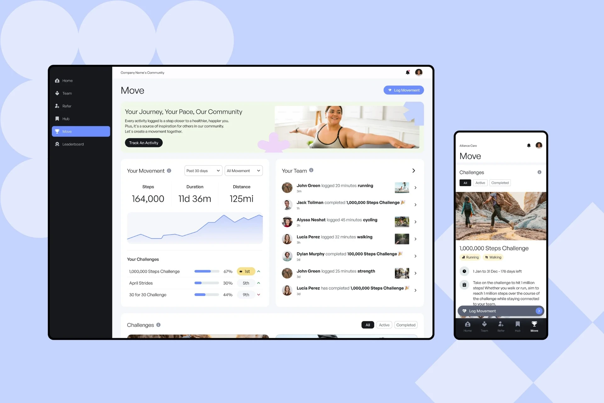
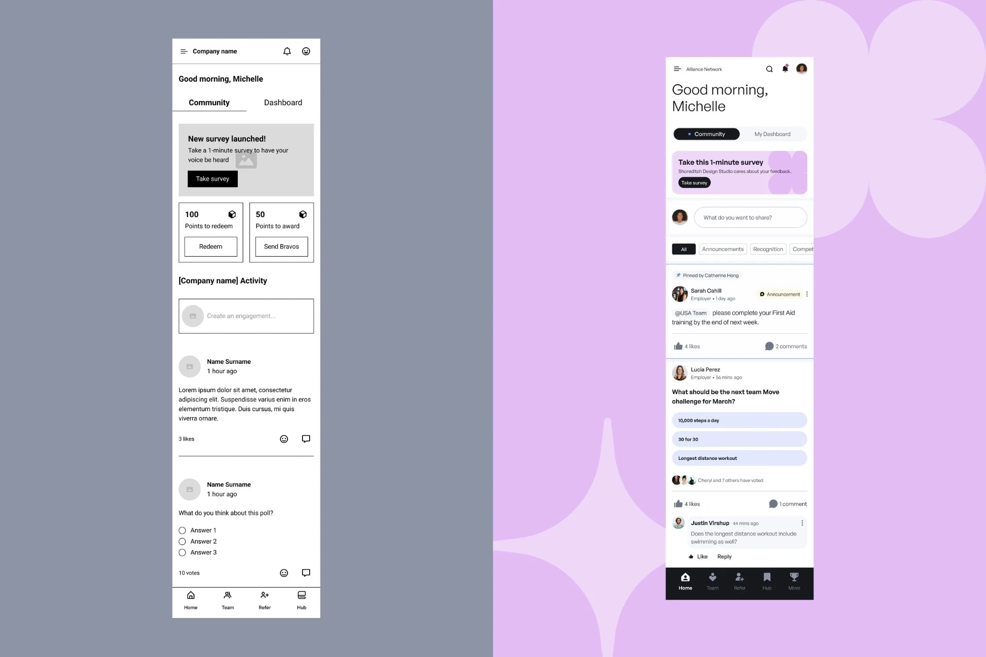
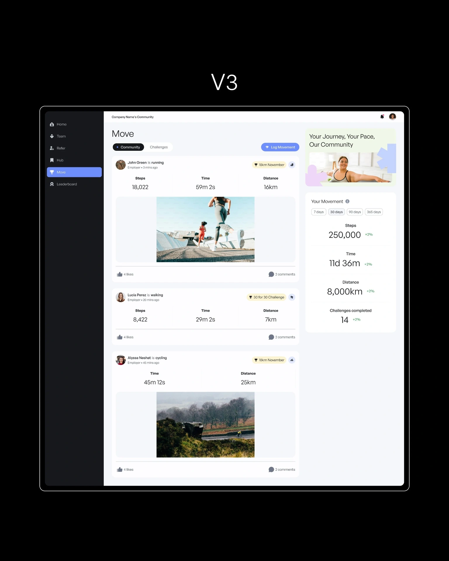
I restructured the information hierarchy to lead with the 'Your Team' activity feed — a live stream of teammates logging workouts, completing challenges, and hitting milestones. The logic: social activity from peers creates normalisation and aspiration simultaneously. Your stats matter less when you can see that everyone around you is participating.
I also reduced the visual prominence of raw stats in the 'Your Movement' widget, replacing the primary stat hierarchy with a progress chart. Charts show trajectory rather than absolute numbers, which is a more forgiving and motivating frame for new or low-engagement users.
Decision 02: Remove the enrolment step.
Original designs required users to actively opt into challenges. In collaboration with the product team, I proposed auto-enrolment: users are added to active challenges by default and can opt out rather than in. This removed a decision point that was likely to create drop-off before engagement even started — particularly relevant for a user base that is time-poor and mobile-first.
The consequence is that users see their challenge progress and ranking immediately on the home screen, without ever having had to consciously choose to participate. That reduces the activation barrier significantly.
Decision 03: Design challenge cards around people, not milestones.
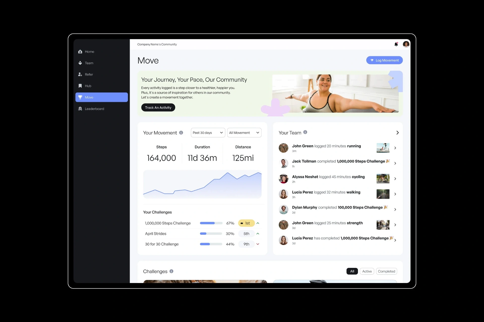
The first iteration of challenge cards were milestone-focused: progress bar, step count, days remaining. They were accurate but impersonal. Iteration revealed a more engaging pattern: profile photos of participating teammates, a live mini-leaderboard, and engagement indicators showing who was active.
The design principle behind this is borrowed from social network research: people respond to the presence of specific individuals they know, not abstract aggregates. Seeing "John Green is 1st, you're 3rd" is more motivating than "67% complete."
Outcome + Impact
The feature secured its place on the product roadmap and is now in active development.
The final designs were presented to both existing and prospective CoachUp Care customers as part of a product roadmap pitch. The response validated demand for the feature and moved it from concept to confirmed development — targeted for mid-2025. The redesigned UI direction was adopted platform-wide.
| Metric | V1 | V2 | Change |
|---|---|---|---|
| Screens redesigned | — | 120+ | Full platform refresh |
| Design concepts presented | — | 2 of 5 | 1 selected by client |
| Design iterations on feature | — | 4x | Brief → final |
| Feature status post-pitch | Concept | On roadmap | Development confirmed |
Because this was a pre-development project, live usage metrics weren't available at handoff. The success metrics I defined for post-launch tracking were: challenge completion rate, feature interaction frequency (tracking, leaderboard, feed), and correlation between platform engagement and shift retention data.
Key takeaways
Designing for behaviour change requires understanding what people are already feeling, not just what they're trying to do.
The most important shift in this project was moving away from a capability frame ('how do we let users track fitness?') to a motivation frame ('what would make someone actually want to do this?'). The research answer — social accountability over personal performance — changed the hierarchy of the entire feature.
I also learned the value of an upfront audit before any new design work. Going into 88 existing screens before touching the brief gave me a realistic picture of the system I was building within and identified which patterns were worth preserving. Skipping that step would have created expensive inconsistency downstream.
The iterative process revealed something worth noting about client work: the brief always evolves as clients see designs. Building in structured feedback loops and leveraging existing component patterns meant each iteration was incremental rather than a ground-up restart.
Next steps
With the feature now in development, the priority is establishing a baseline measurement framework before launch so that the behavioural hypotheses embedded in the design can be validated — or disproved — with real usage data. The specific signals that will tell us whether the social-first approach worked: feed engagement rate, challenge participation relative to opt-out rate, and whether active challenge users show higher platform retention than non-participants.