⟶ 05 / Case
Improved navigation and a new slick UI
Restructured the information architecture of a 531-page water-tech site after two acquisitions, then paired it with a brand refresh that funnels users into self-serve.
Client
AquaPhoenix
Year
2024
Role
UX/UI Designer (Agency)
Tags
UX Research, Information Architecture, Web
Context
AquaPhoenix is a leader in manufacturing and distribution of water and chemical testing products and supplies.
They had acquired 2 other water technology brands, with more acquisitions on the horizon. AquaPhoenix tasked us to design a unified website that effectively communicates the expanded product and service offerings of the combined entity.
Problem
An already large website was about to get a whole lot bigger.
The existing AquaPhoenix website suffered from a confusing site architecture with inconsistent categorisation and a lack of page templates. Additionally, it had a dated visual identity from decades ago that no longer resonated with audiences of today. The website lacked clear call-to-actions and had limited product discoverability, hindering users self-serving to find resources or make a purchase.
The 2 other brands shared the same problems and brought with them 400 pages of content.
Solution
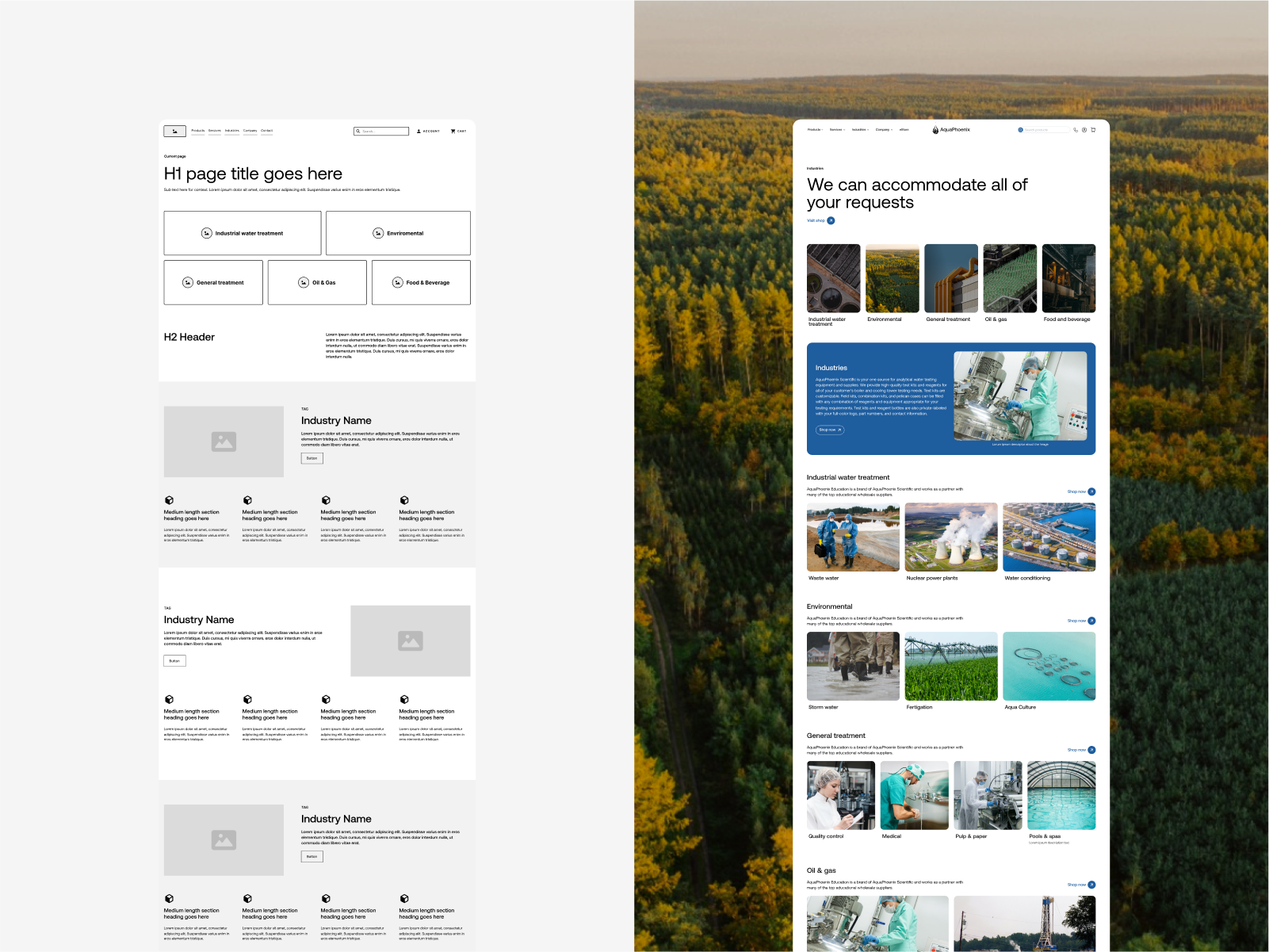
A modern brand refresh and a complete overhaul of the website's navigation and information architecture.
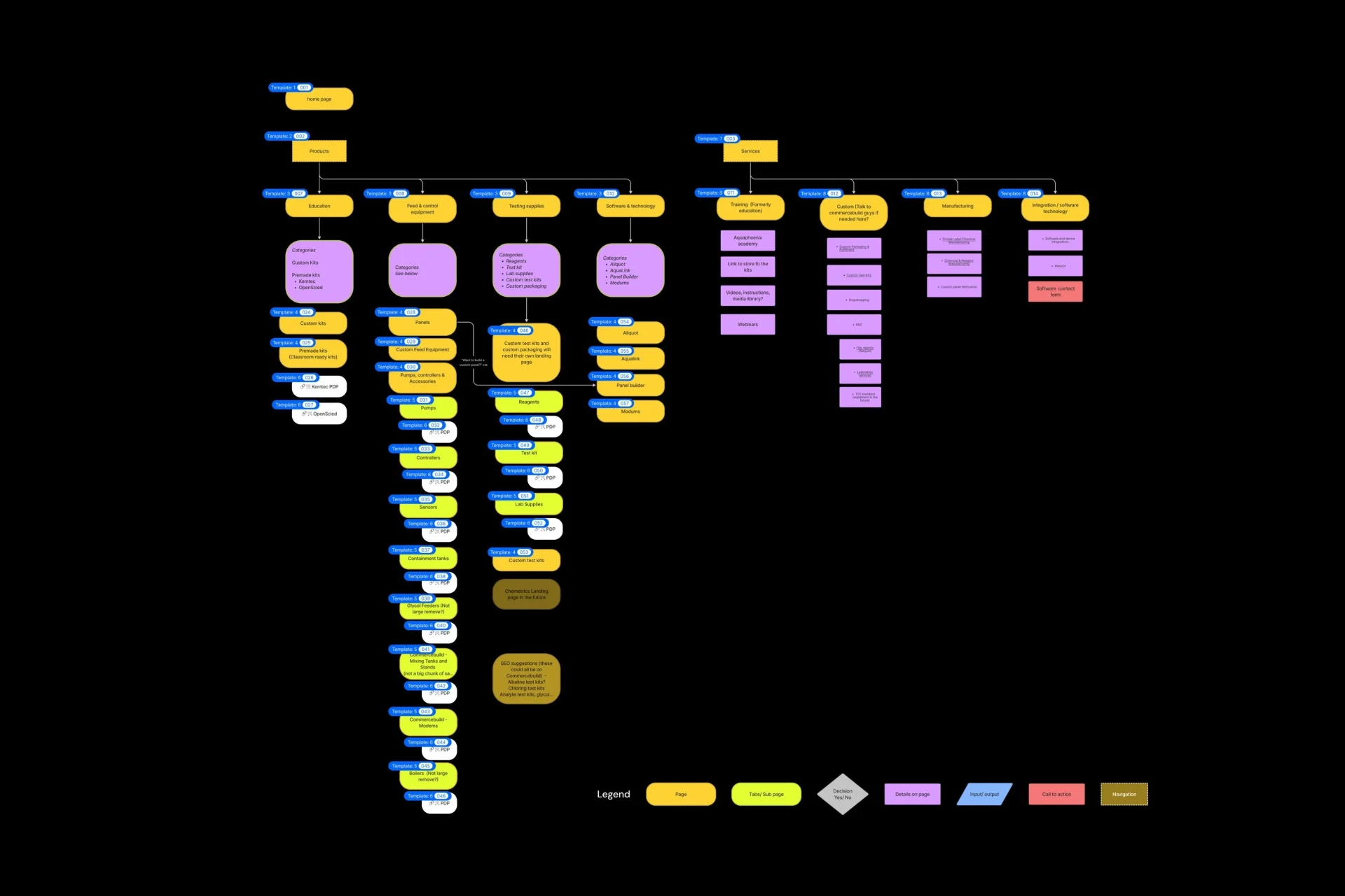
I co-led a client workshop to better understand their goals, their audience, and the competitive landscape. We audited the 3 merging websites and defined that all 531 pages could be categorised into 1 of 18 page template types. Next, I helped assign every page to a new template.
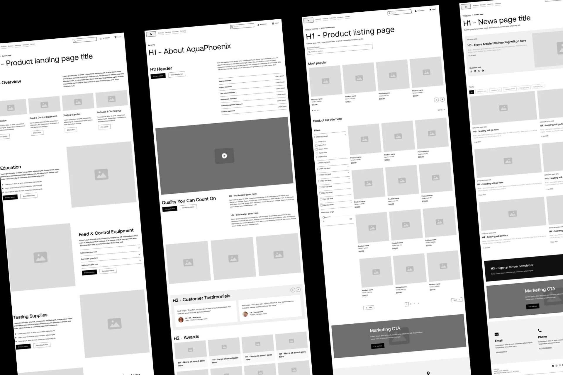
I researched the information architecture of their top competitors and created a new site map and simplified navigation in collaboration with my team and the client. We created wireframes for each page template, while in the background designing and presenting multiple UI concepts. Once the client was happy with a new look and feel, the wireframes were translated into high-fidelity.
Analyse
Keep it simple.
With a massive site like this, the key was to keep the designs and navigation as simple as possible. The existing navigation was problematic in multiple ways:
- Large product categories didn't list subpages, forcing users multiple clicks to get to the desired destination
- Too many items were listed, resulting in a higher cognitive load
- Sector-specific information was hidden within pages, making it difficult to find what is actually relevant
- Competing call-to-actions in the navigation bar
- Unclear and confusing names for pages
- Product and resource pages that were dead ends with no jump-off points
Design
Creating a seamless user journey.
Key changes implemented:
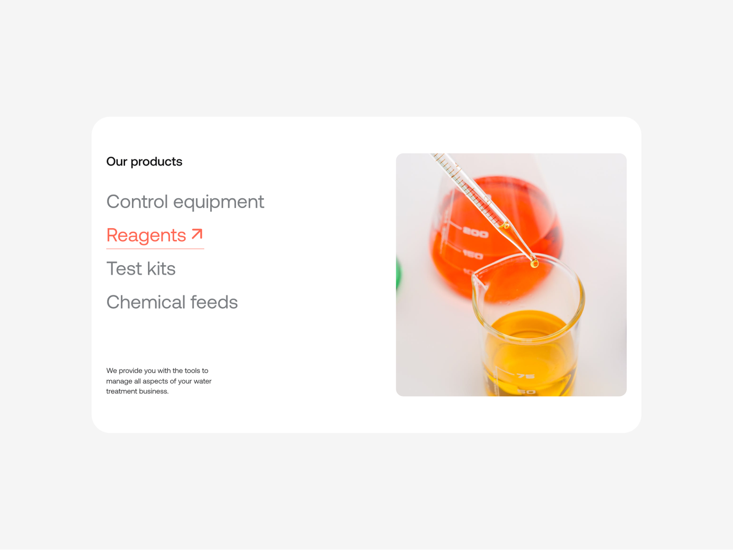
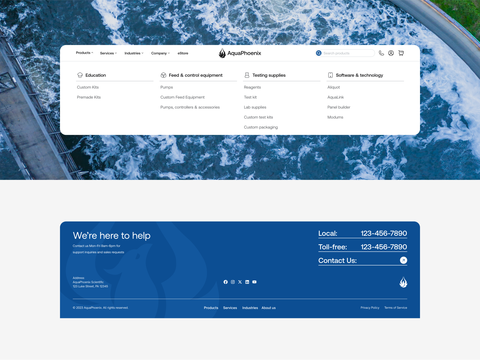
- Designing a mega menu navigation so all product types are viewable instantly
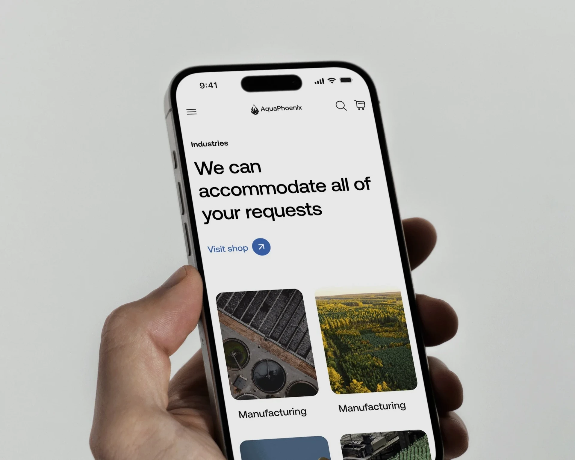
- Introducing an "Industries" category to guide users more efficiently towards their desired products and sector-specific information
- Clear separation of navigation links from core actions (e.g. product search, account, login, contact us)
- Incorporating call-to-actions and signposts on every page template for related information or products for a more seamless experience
Design
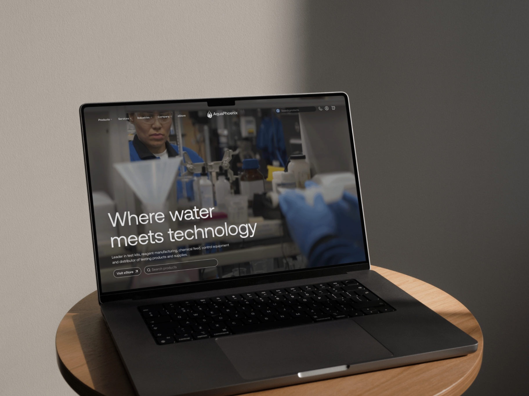
Bring the website into the 21st century.
The UI hadn't been updated since 1990. We collected the client's likes and dislikes of their competitors' visual styles and created moodboards mixing in inspiration from outside the industry. We went through several rounds of presenting UI concepts and iterating based on the feedback.
With an abundance of content on the website and given the product images were less than ideal, my goal was to nail a look that was more minimal, modern, and professional.
Iterate
More emphasis on self-serve.
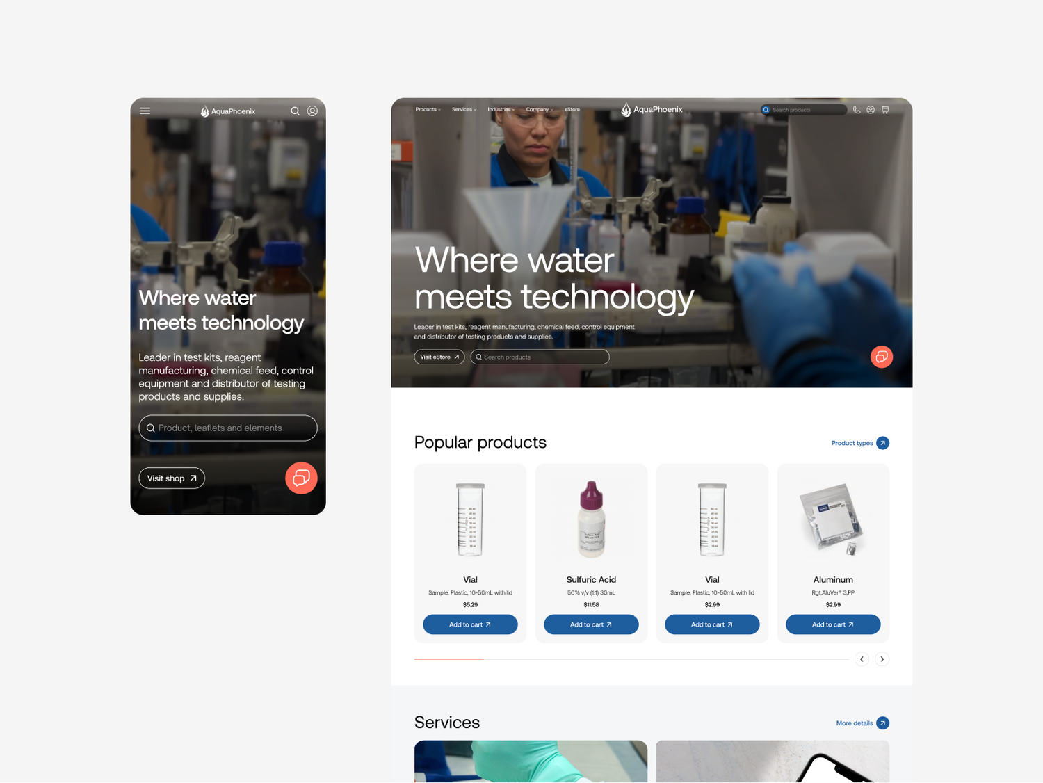
The client's feedback was that they really wanted to encourage users to make purchases without needing to contact their team. The designs were tweaked to put a new search function front and centre on the hero to funnel customers into the eStore.
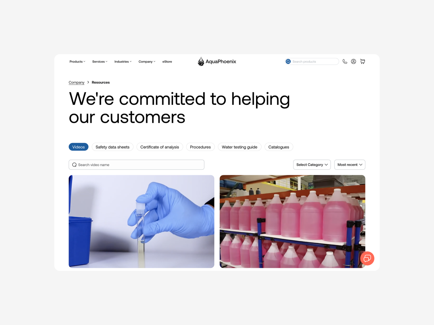
Additionally, new signpost blocks for industry-specific pages and for popular product recommendations were incorporated on the Home page and used throughout the site to increase discoverability and self-serve capabilities. Finally, a new sort and filter system was added to the Resources page to reduce the cognitive load when navigating through hundreds of pieces of content.
Impact
The new AquaPhoenix site went live in April 2024.
It now has an increased pages per visit count (now 2.15) and higher visit duration (up 12 seconds). The client would not disclose the exact data from prior to the engagement for me to calculate the percentage increases.
531
Pages restructured across 3 merging brands
18
Page templates the entire site collapses into
2.15
Pages per visit on the new site
Ideal scenario
Where I would like to take things next
- Analyse which pages users are dropping off on
- Assess and compare the amount of contact enquiries
- Collect data on any change in ecommerce purchases
Learnings
Expectations vs. reality.
This project was a learning lesson in the importance of brand guidelines, design systems, and close collaboration with development teams. A handover resource was prepared but some changes and flows were changed in ways that go against best practice after the fixed term deal.
In the future, I would fight to have more face time with the teams actually building our designs to do a more in-depth handover.